How do you translate a new global brand identity into an experience people can actually understand and use?
The Opportunity
Sage had partnered with global branding agency Wolff Olins to create a bold new brand identity.
The challenge was making that identity work digitally in content design.
The relaunch needed to feel unmistakably Sage while also improving clarity, engagement and conversion across global markets.
My role was to bridge the gap between brand strategy and user experience — turning a new visual and verbal identity into content that felt clearer, more human and easier to act on.
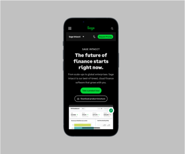
The relaunch gave us the opportunity to rethink not just how Sage looked, but how the experience communicated.
My role
Content Design Lead
I led the content design strategy for the relaunch, working with Wolff Olins, Product, Design, Research and Web teams to translate the new brand into a consistent digital experience.
My work included:
shaping the new Sage tone of voice
developing new content patterns and journeys
balancing brand expression with usability and SEO
creating and testing high-impact messaging
using research to refine content
aligning content decisions with both user and commercial goals
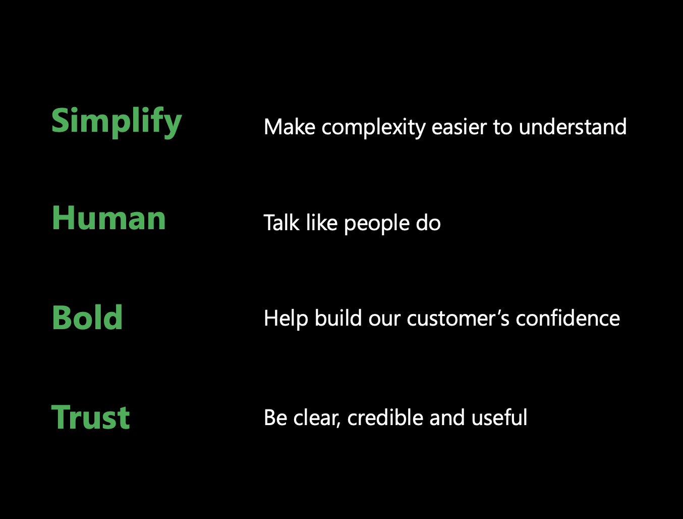
I also contributed to the new tone-of-voice principles: Human, Bold, Simple and Trust.
The challenge
A new brand can look distinctive and still be difficult to use.
Across the existing site, some pages relied on generic promotional headlines, dense layouts and product-heavy imagery. Users often had to work too hard to understand what Sage products did, why they mattered and where to go next.
The opportunity was to make the new brand work harder for the user.
That meant moving from:
Promotional → useful
Product-led → customer-led
Dense → scannable
Static → interactive
Brand expression → brand experience
1. Make the value proposition immediate
One of the clearest opportunities was the Sage Accounting
hero deign.
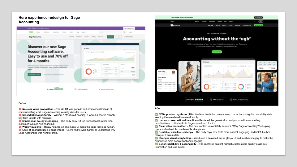
The previous experience led with a generic promotional message and gave the product UI most of the visual weight. It didn't clearly explain what Sage Accounting actually helped customers do.
I reworked the content hierarchy so users could understand the value of the product at a glance.
Before
Generic promotional headline
Product-heavy visual hierarchy
Weak value proposition
The new approach introduced:
an SEO-focused eyebrow to hold the primary search term
a more human, benefit-led headline
clearer supporting copy
stronger content hierarchy
a more balanced mix of product UI and lifestyle imagery
The result was a hero that worked harder for both people and search, without compromising the new brand voice.
After
Search term separated from customer-facing headline
Clear benefit-led proposition
Stronger balance of product and human storytelling
2. Help people explore features, not process them all at once
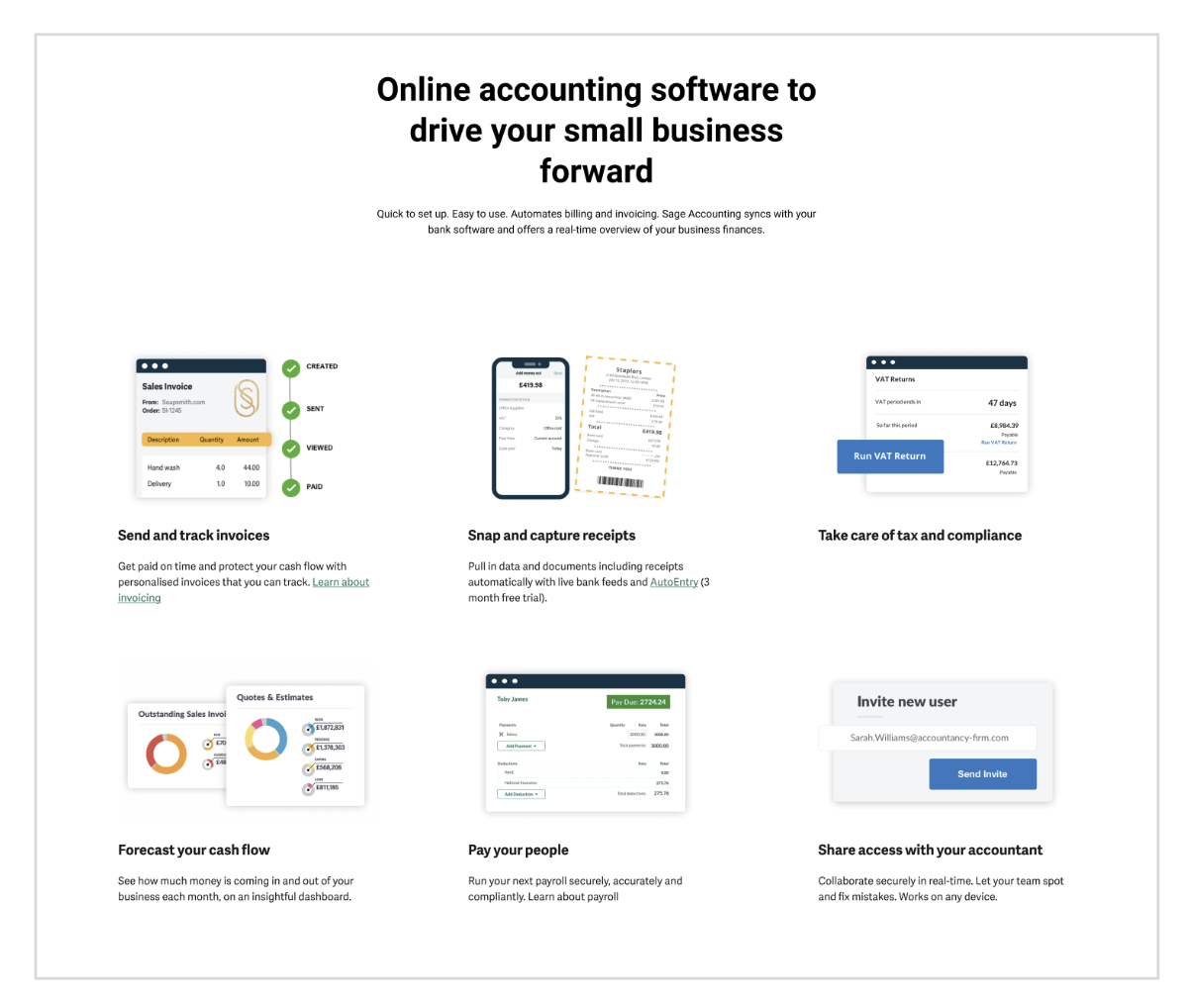
The original features experience presented six features simultaneously.
That made the page comprehensive, but not particularly easy to absorb.
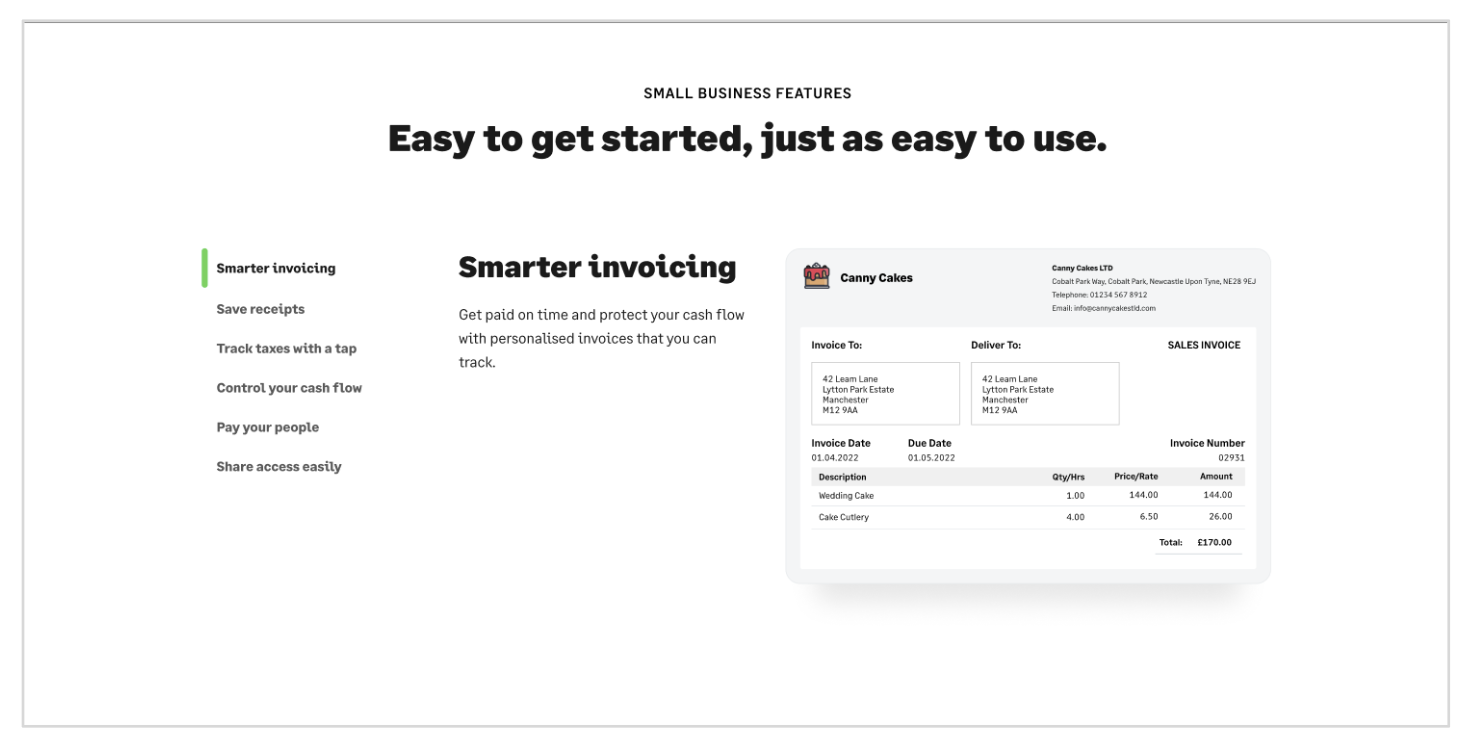
I introduced a tabbed pattern that let users explore one feature at a time, reducing cognitive load while giving each product capability more space to breathe.
The new structure also allowed us to use larger UI examples and more conversational, benefit-led headings.
Instead of making users scan everything at once, we let them explore the product at their own pace.
Before
After
Moved from six competing feature blocks to a focused, interactive experience that reduced cognitive load and gave the product more space to explain itself.
3. Make customer proof feel like a story
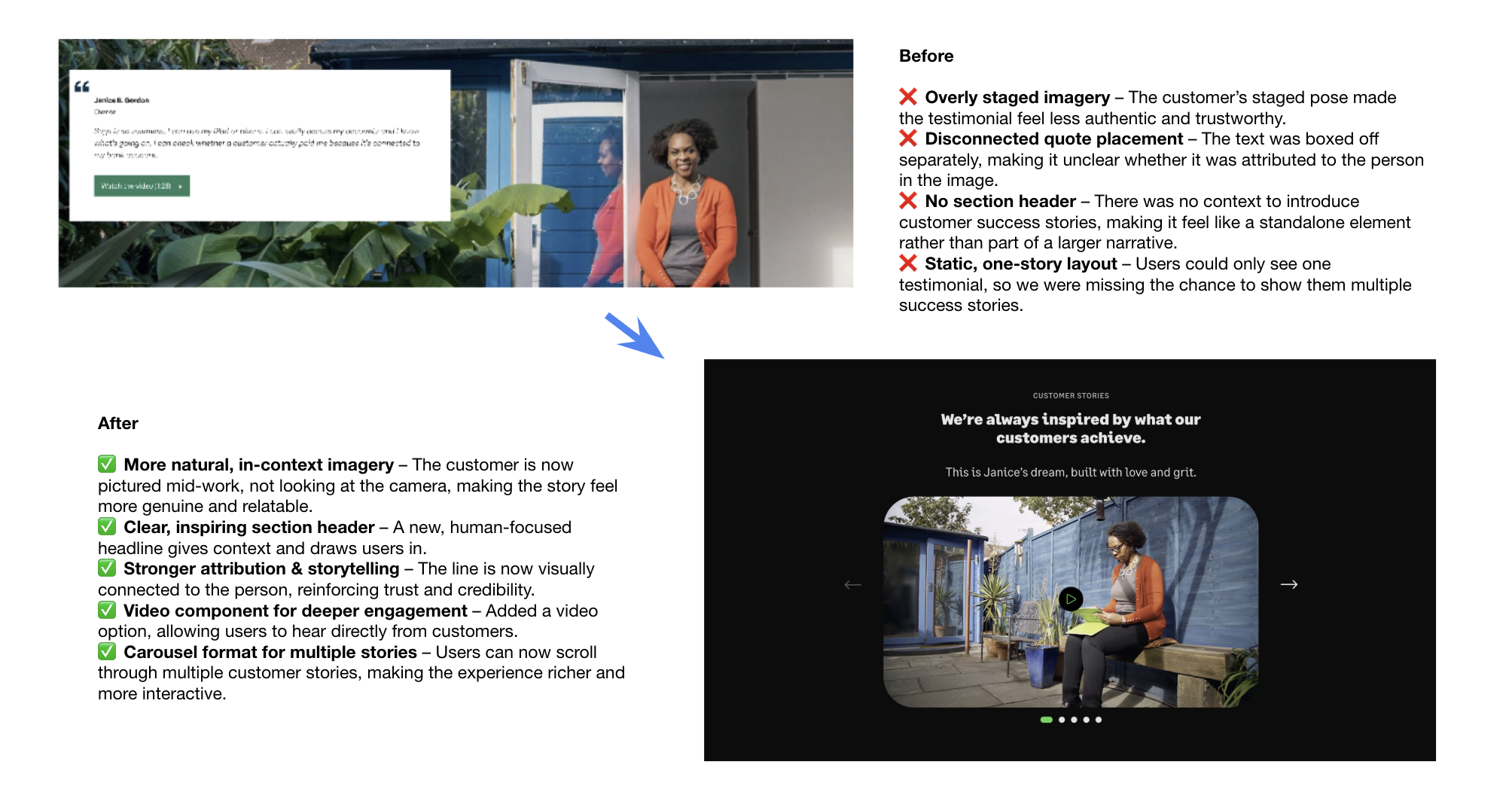
The existing customer testimonial pattern felt disconnected from the rest of the experience.
The imagery was staged, the quote sat separately from the customer and the page could only surface one story at a time.
I helped reframe customer proof as a richer storytelling experience.
We introduced:
more natural, in-context photography
a clearer editorial introduction
stronger visual attribution between customer and quote
video for deeper storytelling
a carousel that allowed multiple stories to be explored
The aim was simple: make customer proof feel credible and human, rather than like another marketing module.
A system, not a collection of rewrites
The important part of the relaunch wasn't any single headline or component.
It was creating a consistent way for Sage to communicate across the site.
The new tone of voice, content hierarchy and reusable patterns helped create an experience that could be applied across different products and markets without losing either brand character or usability.
That was the real content-design challenge: making a bold global brand scalable, usable and recognisably Sage.
The Impact
The relaunch delivered measurable results.
120% increase in user engagement after launch
User Experience of the Year — UK eCommerce Awards
The deck also records improved clarity and conversion rates across the experience.
For me, the most important outcome was proving that brand transformation and user experience don't have to compete.
The strongest digital brands do both.
They feel distinctive while making it easier for people to understand what matters, make decisions and act.
On Reflection
This project changed how I think about brand and content design.
A tone of voice isn't something that sits in a PDF.
It only becomes meaningful when it shapes real decisions:
what we prioritise,
how we structure information,
what we remove,
how products are explained,
and how people move through an experience.
The Sage.com relaunch gave me the opportunity to work at that intersection — using content design to turn brand strategy into a usable digital system.