CONTENT STRATEGY • CONTENT DESIGN
Expedia One Key Loyalty Programme
Helping millions of travellers understand a complex
loyalty programme
through content strategy.
The Opportunity
One Key was evolving into a richer loyalty programme with new rewards, tiers and member benefits. The problem wasn't the programme itself. It was that members struggled to understand it.
Research showed that fewer than one in three Blue and Silver members had a detailed understanding of how One Key worked. Compared with competitor programmes such as Booking.com's Genius, member comprehension was significantly lower, limiting engagement and slowing tier progression.
The Pillar Page sat at the centre of the product experience. It needed to educate prospective members, support existing ones and explain an increasingly complex programme—all while balancing legal, SEO and engineering constraints.
Our opportunity was to rethink how travellers understood One Key.

BEFORE: The existing experience was over 12 scrolls deep, text heavy and prioritised programme mechanics over customer understanding.

My Role
I led the content strategy and content design for the BEX 3.0 Pillar Page.
Working across Product, UX Design, Research, Legal and Engineering, I developed a
content strategy that shaped both the information architecture and the final experience.
How I approached it
I combined user research, experience audits and competitor analysis to identify where comprehension was breaking down. This helped me identify the main problem.
The problem wasn't missing content. It was structural hierarchy.
That insight became the foundation for the strategy, which I boiled down to four content design principles:
1. Lead with value
Help members understand why One Key is worth joining before explaining how it works.
2. Design around member questions
Structure the experience around the questions travellers naturally ask rather than Expedia's internal programme structure.
My responsibilities included:
Developing the overall content strategy
Auditing the existing experience
Defining the content hierarchy
Creating personalised content journeys for signed-in members
Establishing reusable content patterns
Writing production-ready UX content
Leading stakeholder reviews and content iteration through delivery
3. Reduce cognitive load
Strip back unnecessary copy, simplify terminology and progressively reveal complexity.
4. Build for scale
Create reusable content patterns that could evolve across Expedia, Hotels.com and Vrbo.
Designing the Experience
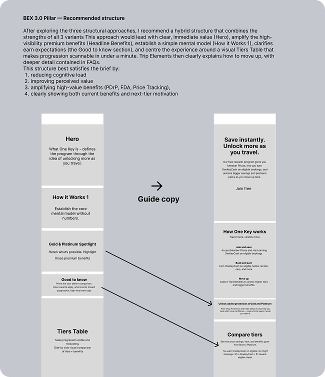
Rebuilding the content hierarchy
The biggest change wasn't the copy. It was the sequence.
Instead of opening with programme mechanics, the redesigned experience introduced the value of One Key first before progressively explaining benefits, earning, tiers and redemption.
The experience became simpler because customers always understood why before how.
Simplifying programme mechanics through progressive disclosure
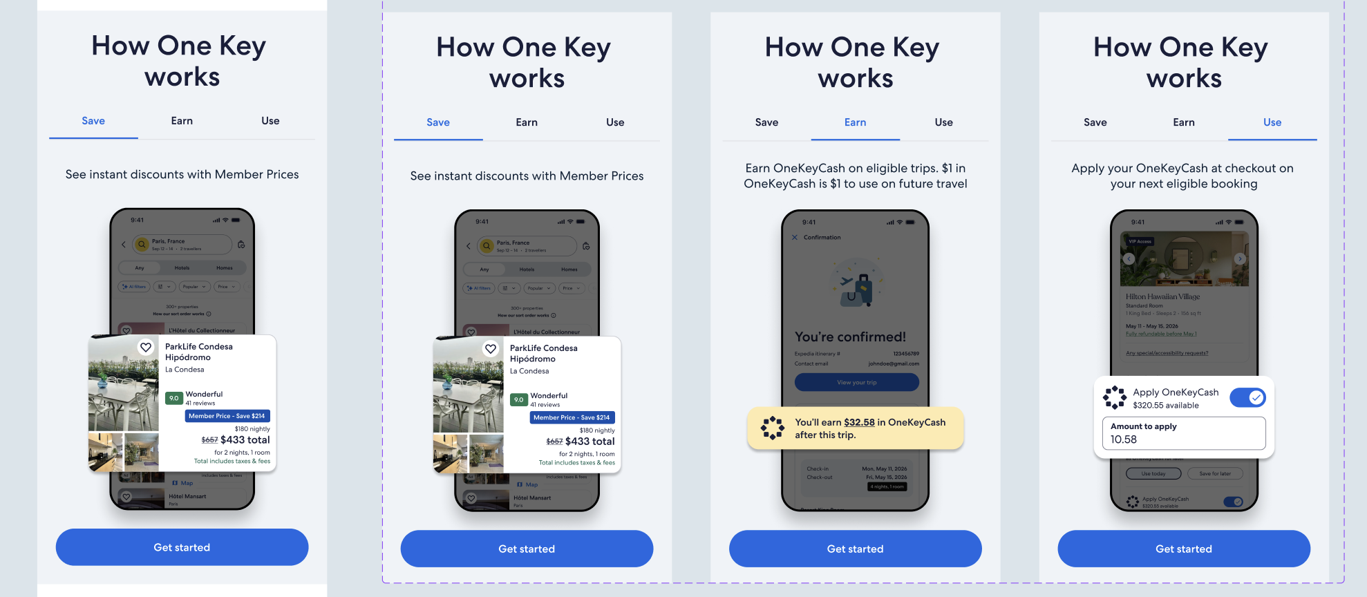
One of the biggest challenges was explaining a complex rewards programme without overwhelming people.
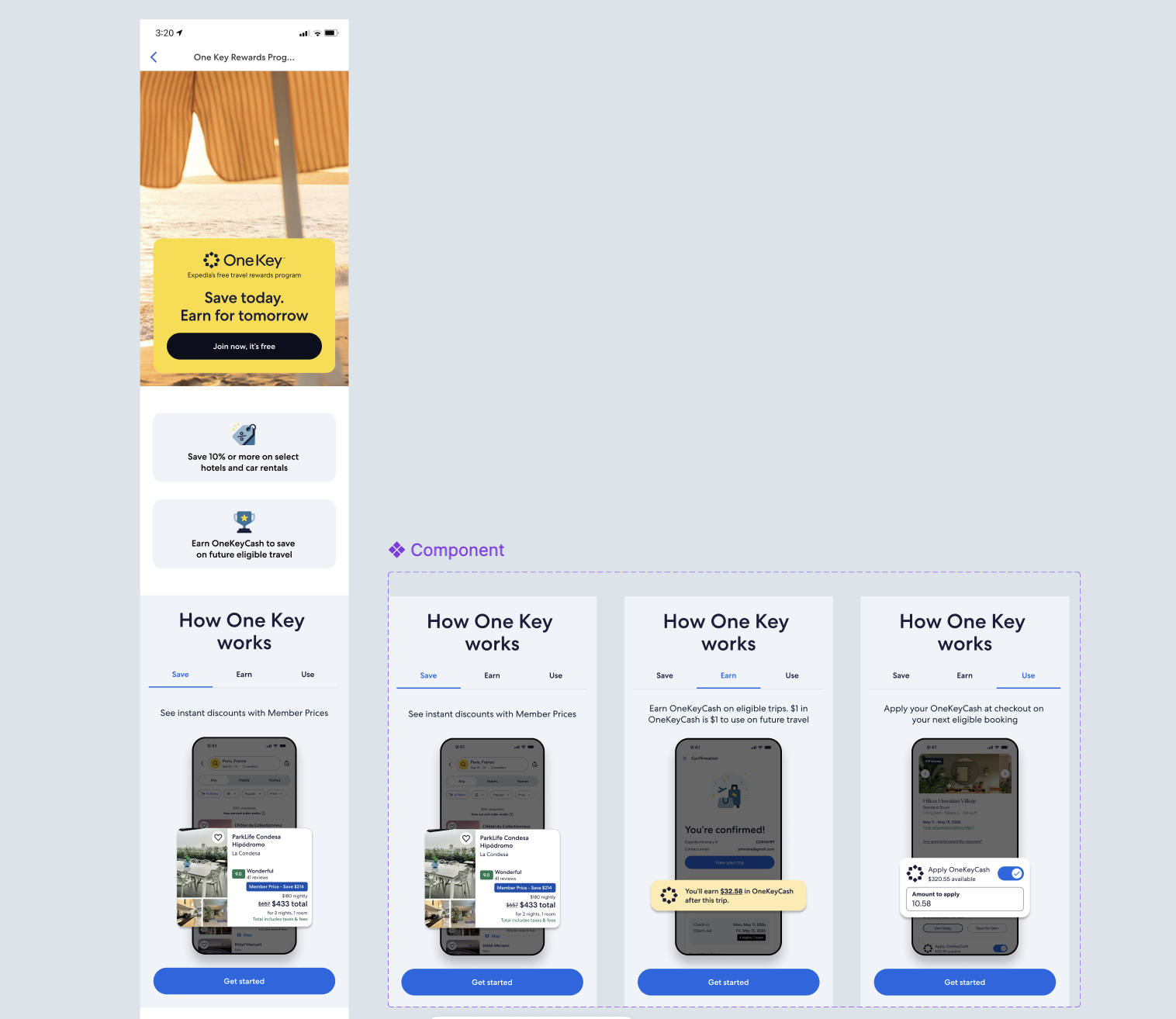
I included a "How it Works" section so members could understand the core mechanics of One Key within a single viewport.
By removing unnecessary explanation and allowing visual hierarchy to do more of the work, we dramatically reduced cognitive load while still supporting customers who wanted more detailed information further down the page.
Making tier differences easier to understand
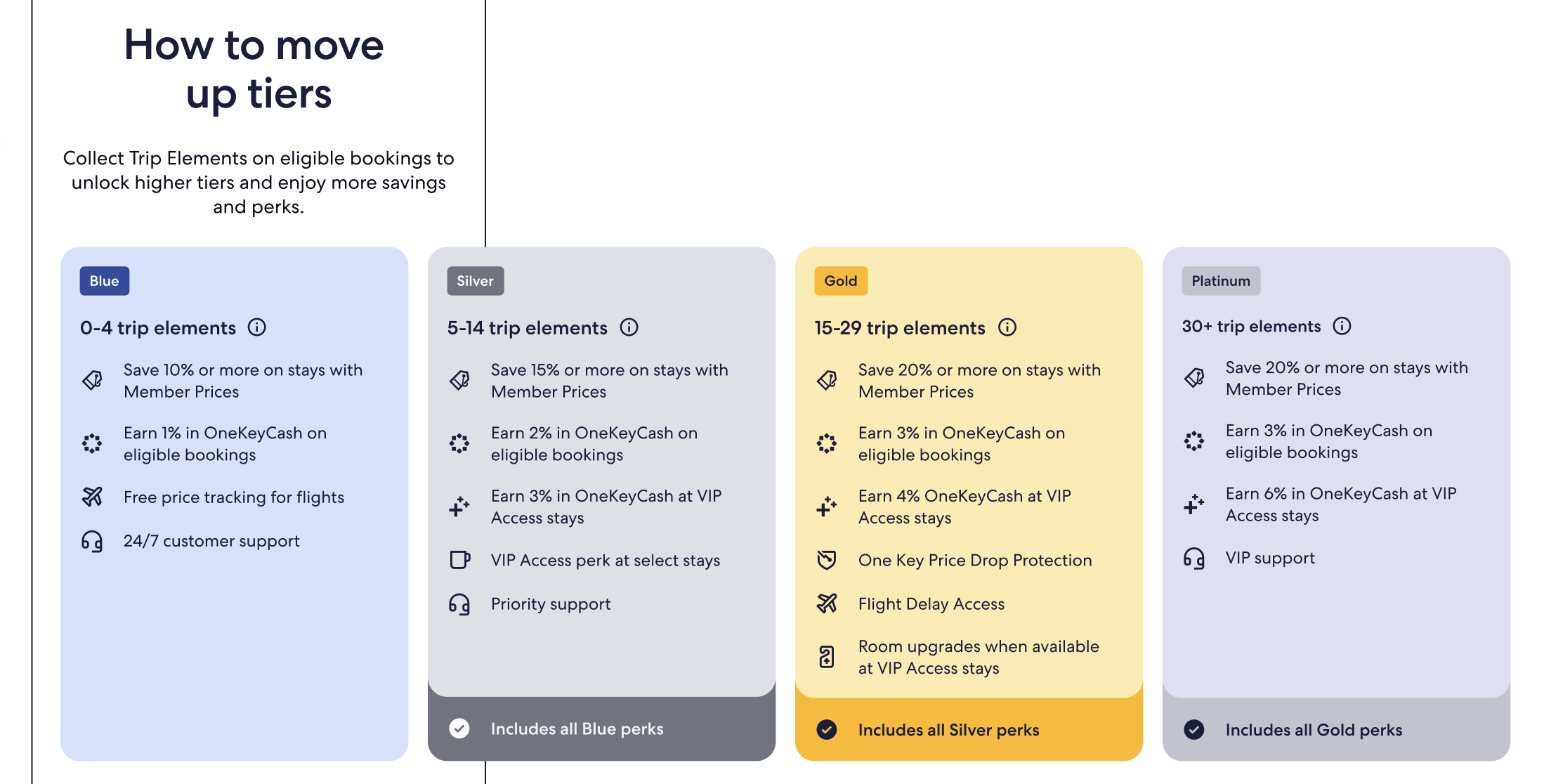
The original concept was a comparison table that showed benefits across all four One Key tiers. When engineering constraints ruled this out, I worked with Design to rethink the experience as a carousel of tier cards.
To make each tier easier to scan, we focused on what it added, summarising benefits inherited from the previous tier rather than repeating them.
Designing for different member journeys
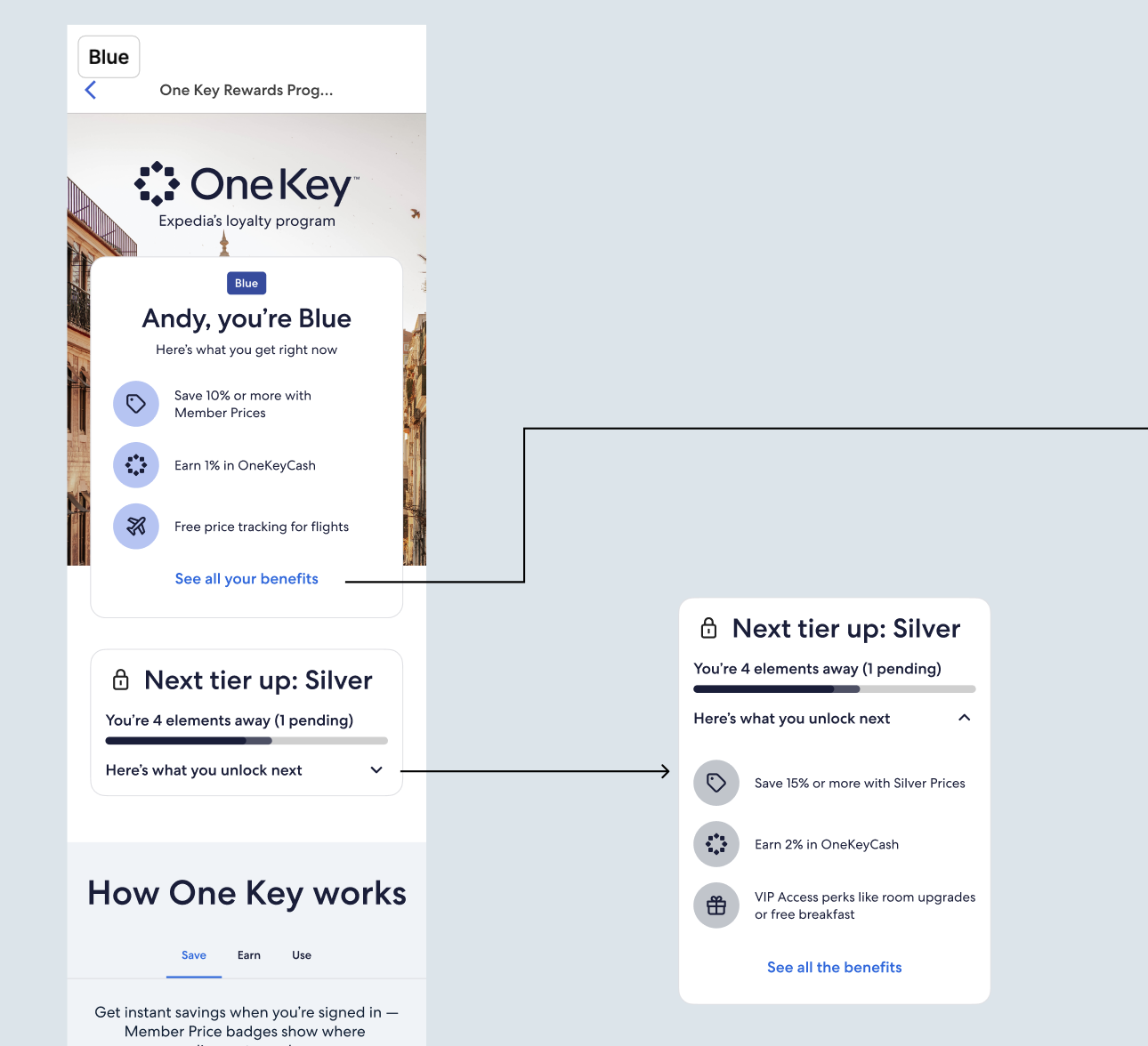
Not every visitor arrives with the same goals. Anonymous visitors need to understand the product and be convinced that One Key is worth joining.
Existing members want to understand their benefits and progress towards the next tier. Research told us that even Blue and Silver tier members had a low product comprehension score.
I developed separate content hierarchies for anonymous visitors and four authenticated member experiences, alongside personalised FAQs that reflected each member's stage of the loyalty journey.
This transformed the Pillar Page from a single information page into a more relevant educational experience for different audiences.
The Impact
The project established a new strategic direction for how One Key is explained across Expedia Group.
The work:
Created a scalable content strategy for future loyalty experiences
Simplified programme comprehension through a new information architecture
Introduced reusable content patterns across multiple journeys
Secured alignment across Product, UX Design, Engineering, Legal and Marketing
Established a content-first approach that influenced both design and implementation
Established the content foundation for future experiences across Expedia, Hotels.com and Vrbo
One thing I'd change?
One thing I missed having during this project was richer behavioural data.
In other roles, I regularly used Contentsquare to understand how people navigated complex experiences—where they hesitated, what they ignored and which sections genuinely helped them move forward.
At the time, Expedia didn't have the same capability for the Pillar Page, so the strategy relied more heavily on qualitative research, stakeholder knowledge and best practice.
Given the opportunity, I'd complement that research with detailed page-level engagement data to better understand how members interacted with each section, where comprehension broke down and which content patterns were having the greatest impact.
I believe the strongest content strategies combine research with behavioural evidence. Understanding what people say is important—but understanding what they actually do leads to even better design decisions.